Adapting Apps for iOS 7
A Blog from Mike Irving, Software Developer
By Mike Irving - Published: 17/10/2013
iOS 7 Marks the biggest change in iOS Design since the launch of the original iPhone, and offers both opportunities and headaches for App Developers.
There are plenty of new UI Controls, APIs and Device Features to leverage, but like most developers, my first rendezvous with iOS 7 Programming came through making sure that existing apps ran in a desirable way.
Existing apps in the AppStore, for the most part, work fine as they are sandboxed in a "iOS 6 Compatibility Mode".. meaning that by and large they both look and behave as before, with the legacy UI.
However, any new versions (updates) of Apps, or indeed New Apps, must support the iOS 7 UI.
I have had a few small niggles to deal with in some of my apps, but the main change to address concerns the way that iOS 7 treats the screen area.
In iOS 7 the Status Bar (the bit with the clock, battery meter etc) is part of your app canvas, and the area behind the Tab Bar is also an addressable area of the screen.
Add in the fact that the Tab Bar, UITabBar, has also changed size, and we have quite a few changes to tackle straight off.
Upon running your apps in the iOS 7 Simulator for the first time, you may notice that your Navigation Bar, UINavigationBar, is misplaced, overlaying the Status Bar. Other screen elements may also have shifted up, and your View may have extended under the Tab Bar.
For future apps, you may wish to leverage these changes to make apps that roll under the Status Bar and it's great new Translucent look, but you can also apply some simple fixes to fix the app area to that used in iOS 6, i.e. the space between the Status Bar and the Tab Bar.
Deltas
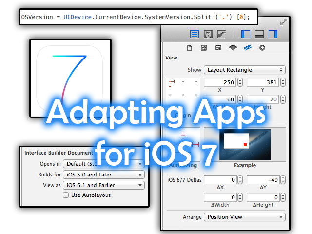
Use the iOS 6/7 Deltas in the Interface Builder to adjust the screen iOS 7 screen behaviour to broadly match that of iOS 6.
In the Interface Builder Document section, set the "View As" to "iOS 6.1 and Earlier", then apply your iOS 7 deltas in the layout options.
For elements aligned to the top of the screen, use +20 as the Y Delta. For those bottom aligned, set the Y Delta to -49 (iPhone) or -56 (iPad).
If you need to reduce the size of a view to match the constrained size (the view between the Status Bar and the Tab Bar in iOS 6), reduce the screen by -69 (iPhone) and -76 (iPad).
Programmatic
You can also apply changes programmatically. Query the systemVersion property of UIDevice.currentDevice to get the iOS version.
Xamarin example below:
(split to return just the major version number, i.e. "7.0.2" becomes "7")
OSVersion = UIDevice.CurrentDevice.SystemVersion.Split ('.') [0];
View Blog Entries...
Page: 1, 2, 3, 4, 5, 6, 7, 8, 9, 10, 11


