Mobile Website Optimisations
A Blog from Mike Irving, Software Developer
By Mike Irving - Published: 23/11/2015
Slowly, over the last few months, I have been readying a new version of this website. Ironically, as a Mobile Software Developer, the previous version wasn't "Mobile Friendly", meaning that Smartphone and Tablet users had to deal with my full-size website, shrunk to fit their mobile device.
The main reason that I had not got around to "mobilising" the website was simply lack of time. I have been working in Mobile (Apps and Web) since 2010, but work-related projects always came first.
I have now adjusted the website to use Responsive Design, meaning that the pages will adjust and respond to the device on which they are being viewed.
The rework didn't end with cracking the Responsive Layout though, I wanted the website to be leaner and faster, both for users, and for my web server to host.
I used the tools Google PageSpeed Insights and YSlow from Yahoo! to determine where improvements could be made, and addressed these where I could.
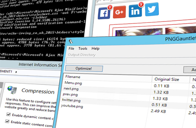
My website runs on Windows Server. In IIS, I implemented Compression and Caching, for both Static and Dynamic Content.
I reduced the size of several key graphics, using PNG Compression. I'd recommend the Windows App PNGGauntlet for this purpose.
I also "Minified", where possible, JavaScript and CSS files. For this, I used the Microsoft Ajax Minifier as part of my build process.
Other improvements have included moving render blocking CSS and JavaScript below the fold, minimising DNS lookups, and calling external libraries from CDN (Content Delivery Network) URLs.
The website now runs very fast on all devices.
Now live, the newly revamped website is very much an ongoing project, which will continue to evolve.
View Blog Entries...
Page: 1, 2, 3, 4, 5, 6, 7, 8, 9, 10, 11


